In most spreadsheet programs a Summary Table is called a pivot table.
Do This: With the spreadsheet open in Google Sheets choose * Data -> Pivot table... *
This tutorial will take you through making summary tables. A summary table is a new spreadsheet that instead of having all of the data, has new data that has statistics computed from the original data. See the Data Statistics Chapter of the wikibook for a discussion of some of the data statistics that you can use in summary tables.
To start, make a copy of Teenage Movie Ratings Subset.csv and open it in a spreadsheet program.
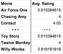
We're first going to make a simple summary table that shows the average rating for every movie that's in the data.
Here is what we're going for:
In most spreadsheet programs a Summary Table is called a pivot table.
Do This: With the spreadsheet open in Google Sheets choose * Data -> Pivot table... *
The menu on the right side of the pivot table lets you choose what you want the rows, columns, and values to be in your summary table. We want to set it up so that:
The power of the pivot table is that it allows you to compute things you could never do by just filtering and sorting. The pivot table is doing a lot of computing behind the scenes for you - which is great - but you should understand what's really happening so you can make your own choices in the future. Here's a synopsis:
Change summarize by from AVERAGE to COUNT. Now, instead of computing the average rating, this will count the number of ratings for each movie.
Let's show both the average rating and the count side-by-side in the table. To do this we add another Values field. The count is already there, so let's add the average rating again. Now, for each movie we'll see the total number of ratings the average rating.
There's not much more to it than that. Once you get the hang of pivot tables they can be a very powerful tool for manipulating data. There are more advanced things you can do with a pivot table if you like, but you know enough now that you can probably just play around with the other settings and see what happens. Key Ideas:
Let's look at two more features of pivot tables that will allow you to do more complex investigations of your data.
We learned that a Row in a pivot table specifies an aggregation or grouping of items for which you want to compute a value. A Column in a pivot table is just another aggregation, but it displays the values across the top of the table. It's easier to understand when you see it...
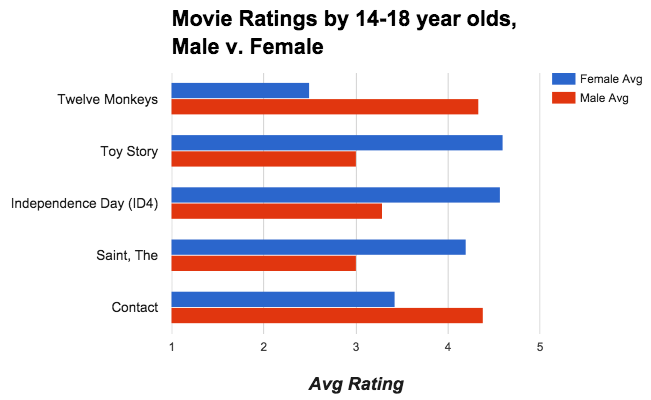
Do This: Add columns that group your data by gender, as in the animation below.
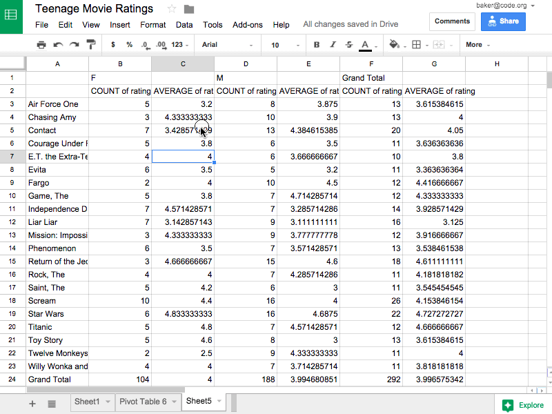
The image above show adding columns grouped by gender. The resulting table shows the average rating and count for each movie, but also broken down by gender. The pivot table also preserves the "Grand Totals" which is what the data would look like if no columns were specified.
Applying a filter to a pivot table does the same thing as it does in the normal spreadsheet - it allows you to filter out values from the raw data.
The animation below shows first filtering out 14-year-olds from the calculations, and then filtering out some of the movies. You don't have to do this, but in some instances it can be a very useful tool.
If you want to maninpulate the data further, to sort or filter, you shouldn't do it in the live, active pivot table. Instead you should copy the table, and paste the values into a new spreadsheet. Note: "Paste Values" is not the same as a normal "Paste".
Do This: Copy the pivot table, create a new tab in the spreadsheet and do Edit -> Paste special -> Paste values only. Watch the animation to see how.
The above images shows copying a pivot table, making a new tab in the spreadsheet, and pasting values. "Why Paste values only instead of just Paste?"
A summary table can be a good first step toward a great visualization. You often want to summarize data first, then chart it, so you can see larger connections or patterns. Summary tables also don't have to be small! You might make a summary table that is still too big or full of numbers to see any trends in the data. For example, from the original movie rating data (which had roughly 65,000 records) if you make a pivot table that shows the average movie rating for every possible age group the table will be about 75 rows long with a whole bunch of decimal numbers. You can't see any trend or pattern in the data just by looking at the table. But if you plot the results on a graph you can!
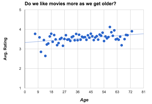
NOTE: A deeper investigation of the data shows that the number of movies rated by people at this web site declined steadily after age 28. The upward trend may be affected by the fewer number of ratings.