 Open a new workbook in Google Spreadsheets.
Before you can draw a chart using Google Spreadsheets, the numbers that compose the chart must be entered in a workbook. There are four general steps in defining a chart.
These four steps should be performed in this order. Note that since the chart is linked to the workbook data, any subsequent changes made to the workbook are automatically reflected in the chart.
You will be making two charts in this part of the tutorial. The first chart will be a pie chart and the second chart will be a column chart.
Pie charts are used to show relative proportions of the whole, for one data series only.
Data series are a group of related data points.
A data point is a piece of information that consists of a category and value.
For example, if you were collecting data on how couples first meet, then the number of couples who met through friends would be a data point. In this case the category is "through friends" and the value is the number of couples who met that way.
When you create a chart with Spreadsheets, the categories are plotted along the horizontal or X-axis, while the values are plotted along the vertical or Y-axis.
Data series originate from single worksheet rows or columns. Each data series in a chart is distinguished by a unique color or pattern. You can plot one or more data series in a chart except for pie charts.
An example of a data series is the population of the United States over ten years. Each data point would be made up of a year (the category) and the population in that year (value).
The first step in creating any chart is to enter the data in a workbook.
Open a new workbook in Google Spreadsheets.
Save your workbook as "expenses".
Enter the following data into your expenses workbook: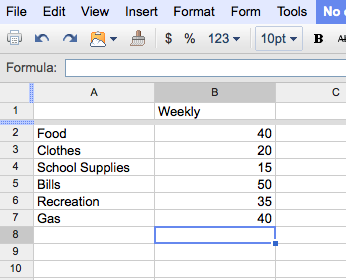
Select the data that you just entered (i.e. select the area A1:B7)
Click the Insert option on the menu bar, and then the Chart icon. In the new window, first select the "Charts" tab and then select the Chart type as Pie, then select the "3-D Pie" icon (as shown below).
Your workbook should now look as follows: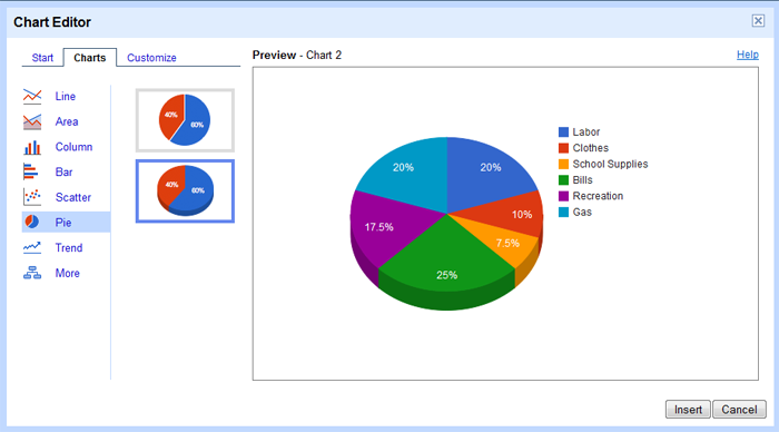
Now it's time to optimize the chart. First let's change the chart's Title.
Click on the Customize tab and in the Chart Title type "Weekly Expenses"
Now let's move the chart's Legend from the right side of the chart to the bottom.
Under the Layout options (underneath the Chart Title), select the Bottom radio button (as shown below).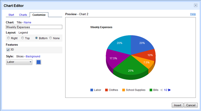
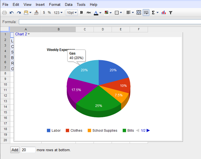
Your "expenses" workbook should look as follows: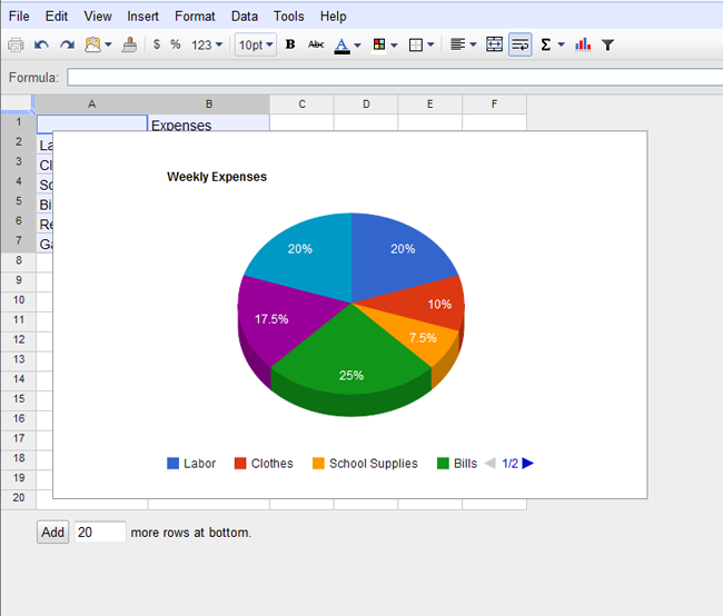
If you click on a pie slice with your cursor, a small box will appear containing the items' name, the value of it, and it's overall percentage.
Finally, let's move the chart to a separate worksheet.
Click on the Chart to highlight it. In the top left corner a drop down menu will appear. Click on it and choose Move to own sheet.... The chart will then appear in your workbook, creating a new Sheet for your work.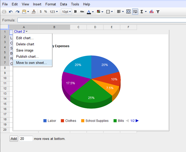
Your "expenses" workbook should look as follows: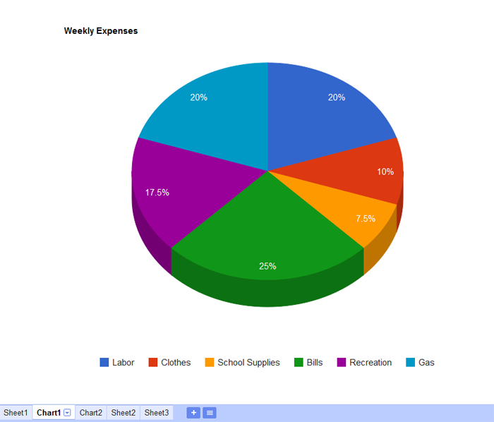
Since changes are saved automatically, you can simply just close the "expenses" workbook.
Now you are ready to create another type of chart called a Column Chart.
Next Topic: Creating a Column Chart
Back to Main Menu