Do This: Take a moment to look at your visualization. You can switch between "View" and "Edit" mode with this button:

There are many different kinds of charts that are used to visualize data. In this lesson, you will learn to make scatter, line, and bar charts, but there are many other types of visualizations that people use to interpret data in different ways. Look through the Data Visualization 101 Guide and familiarize yourself with the different chart types, paying particular attention to the scatter, line, and bar charts.
Do This: First, make sure you are logged into your Google Drive account. Then, click the link below to see the data set you will be using: MovieRating_avgRatingByAgeByGender.csv To make your own copy in your local Google Drive, click the "Open" icon:
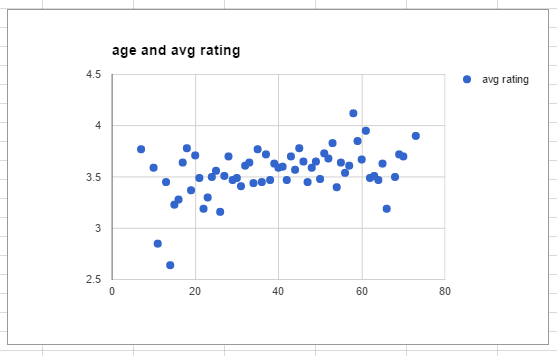
The first type of chart you're going to build is a scatter chart. Scatter charts are useful for finding relationships between two types of data. In this exercise, you will build a scatter chart that shows the relationship between movie reviewer age and average movie rating.
Do This: Select the "age" and "avg rating" columns, as show below.
Select the "age" and "avg rating" columns.Hint: To select an entire column, click the top cell (ex. A1), then hold down the "SHIFT" key and select the last cell from the last column you want (ex. B62).
Google gives suggestions of what kind of chart you can make from your data, but for this exercise you're going to ignore those suggestions and make the chart yourself.
Do This:
At this point, your chart should look something like this:
Do This: Take a moment to look at your visualization. You can switch between "View" and "Edit" mode with this button:
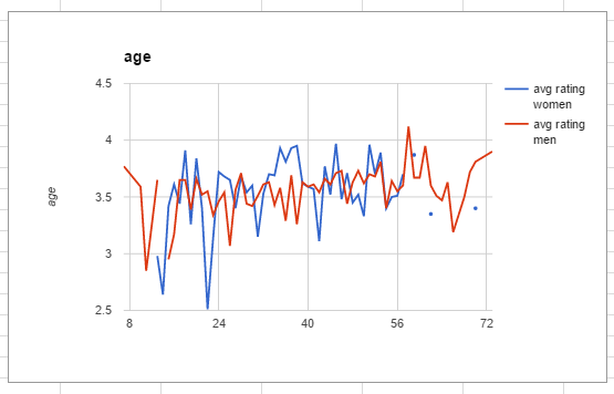
You can use many different kinds of charts to look at the same data. You'll now investigate different columns of your data with a line chart. Line charts are helpful for showing the progression of values over time. In this case you will be showing how the average movie rating changes with the reviewer's age.
Do This: Select the "age," "avg rating women," and "avg rating men" columns. Select the first column of data using the mouse. Hold down the "Control" key, (or "Command" on a Mac) and select the additional columns of data. To select cells in non-adjacent columns, you need to use some fancy hotkeys:
Do This:
At this point, your chart should look something like this:
Once your chart looks close to the one above, switch to View mode and take a moment to look at your visualization.
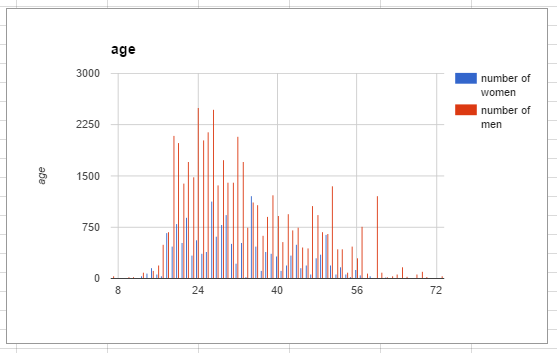
In this exercise, you will use some different columns in the spreadsheet to create a bar chart. Bar charts are useful for viewing data grouped by different categories.
Do This:
Do This:
At this point, your chart should look something like this:
You've now successfully learned to create charts! Now you'll learn to further customize the appearance of your chart, which will make your visualization easier to read and understand. This exercise will walk you through the steps to customize the line chart you created earlier, but these same steps can be applied to any charts you make in the future.
Your chart should include labels that indicate what the axes represent. Include measurement units, if applicable. Do This: Rename your horizontal axis to "Age (years)" and your left vertical axis to "Movie Rating". Hint: You will need to right-click the chart to access the axis labels.
You may notice that the labels in your legend are not very official-looking. To change the text that appears on the chart, you have to change the text in the column headers themselves. Do This: Change the legend labels to "Avg. Rating: Women" and "Avg. Rating: Men". Note: If you can't read your legend labels because the text is overlapping, try adjusting the style (bold, italics, etc.) of your legend.
Examine both the far right and far left sides of your chart. Notice that both the men's and women's lines do not run continuously across the entire graph. The men's line has a gap on the left side of the chart, and the women's line ends shortly after age 55 and only has a few dots after that. These discontinuities appear because there are gaps in the data set. Do This: