 Open your "expenses" workbook.
Column charts use bars of varying lengths to indicate amount. The bars are of different colors or patterns to indicate the different type of data, and they run vertically across the chart.
Open your "expenses" workbook.
Click on the  button at the bottom of the "expenses" workbook to enter the data for your column chart.
Create a worksheet that looks as follows: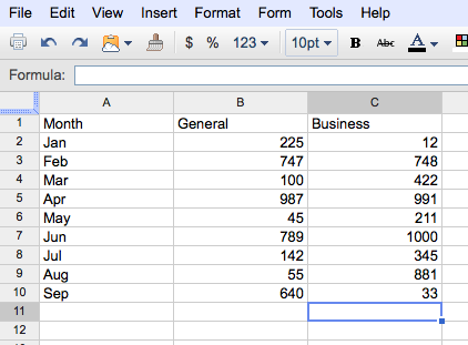
Select the data to be charted.
From the Insert tab, click the "Chart" option. In the new window, from the "Start" tab, select the "column chart" option (as shown below).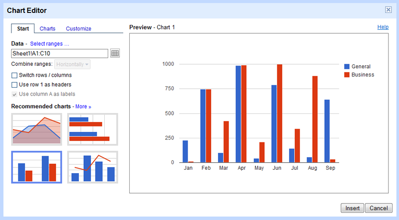
While still in the Chart Editor window, select the "Customize" tab. Enter the Chart Title as: Hotel Registration.
While still on the "Customize" tab, add horizonal and vertical "Axis Titles" to your chart. Change the hortizontal Axis Title to: Month. Change the vertical Axis Title to: Number
Save the chart.
Finally, move the chart to its own spreadsheet. (Click the "chart in the top left corner of the column chart and select Move to own sheet....)
Your completed chart should look as follows: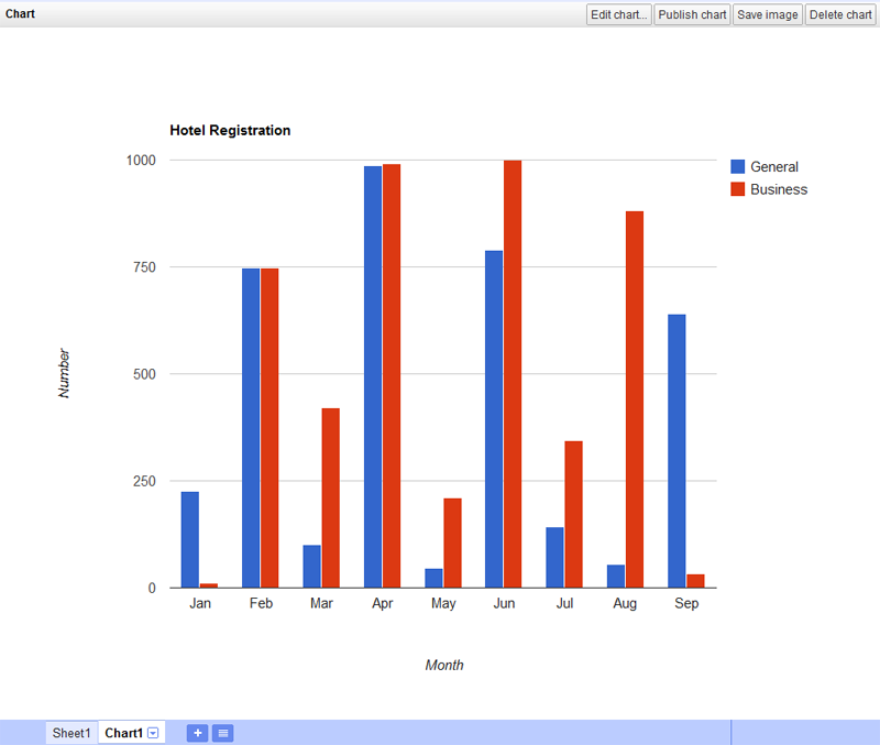
Since changes are saved automatically, you can simply just close the "expenses" workbook.
Congratulations! You have finished the Google Spreadsheets tutorial. Return to the main page to view the rest of the homework assignment.