Data Analysis - Spreadsheets and Visualization
The objective of this assignment is to use spreadsheets to manage and analyze data. It will use Google Sheets, which is a spreadsheet application comparable to Microsoft's Excel.
Place all answers and screenshots in a Google Document. The steps below will tell you what to put in the assignment document. Put the question number from the assignment leading all entries in the assignment document.
*Part 1: Data Visualization - Good and Bad
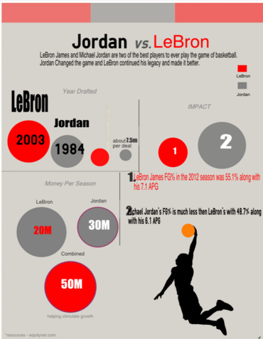
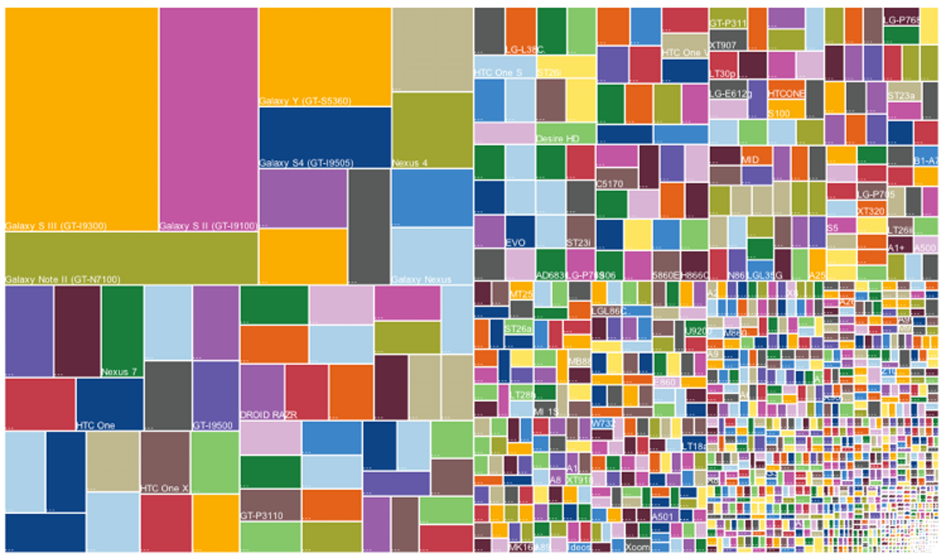
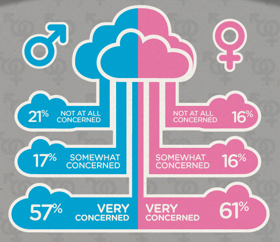
Making good data visualizations is hard work, even for so-called experts. In this Part you will review a collection of data visualizations. Some are strong data visualizations that create a deeper understanding of the underlying data. Others are difficult to interpret or even just hilariously bad. Your job is to rate the quality of the visualizations and keep a few notes about why they are good or bad.
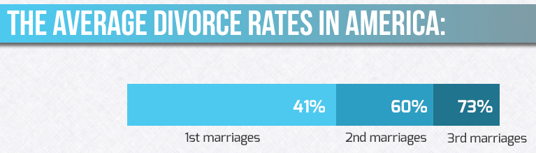
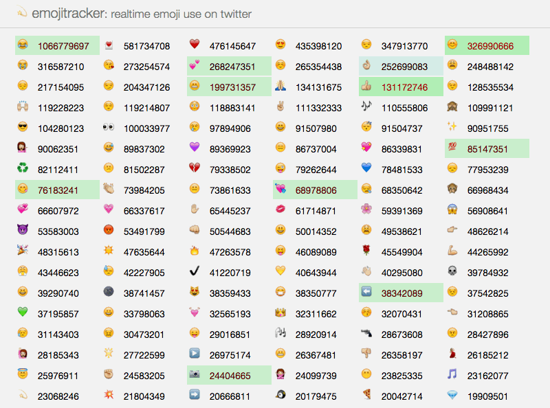
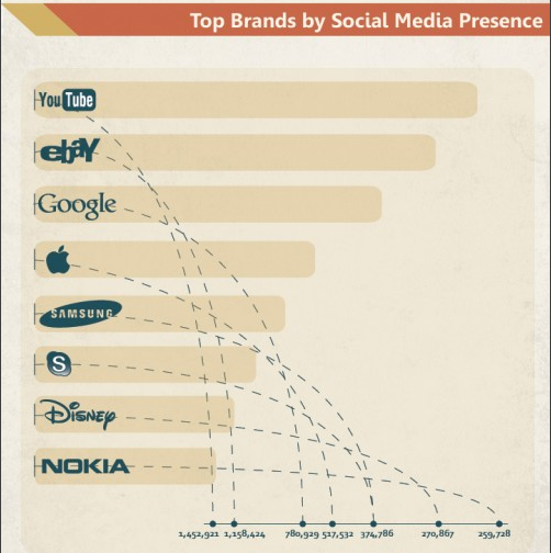
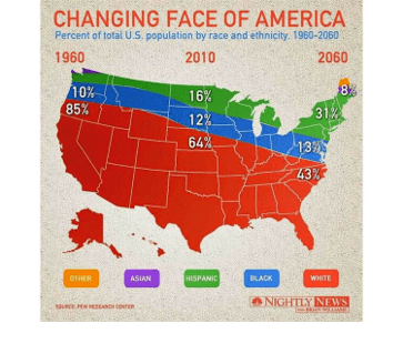
In your answer docoument place the letter of the visualization and then answer these two questions for each visualization (click on the image to see a bigger, clear, image):
- What is the visualization trying to communicate?
- Is the visualization effective? Why?
- Place in your answer document an image that shows visualization of data related to your final project topic.
- What search tool did you use to find it? What search terms did you use?
- What is this visualization trying to communicate?
- Is this visualization effective? Why?
*Part 2: Making Data Visualizations
Good visualizations can help people make sense of data sets that are too large to interpret by looking at the raw data. In this part you will learn to use a spreadsheet tool to make visualizations of your own.
There are many different kinds of charts that are used to visualize data. In this lesson, you will learn to make scatter, line, and bar charts, but there are many other types of visualizations that people use to interpret data in different ways. Look through the Data Visualization 101 Guide and familiarize yourself with the different chart types, paying particular attention to the scatter, line, and bar charts.
Disclaimer: This exercise is about using charts to explore trends in the data - not about creating the world's greatest chart. While the early parts of the lesson will walk you through very specific steps to make a particular chart, by the end of the exercise you will be creating your own customized charts to see what trends you can discover in the data.
Follow this tutorial to create:
- A scatter chart
- A line chart
- A bar chart
In your answer document, respond to these questions about things you do in the tutorial:
- Share your Google sheet with the email address provided by your instuctor. Paste the URL in here.
- Place in your document a scatter chart similar to the one that you created in the Do A Visual Check of Scatter Chart part of the tutorial. It should have an appropriate title that includes your full name, an appropiate legand, and appropriate ranges.
- For this scatter chart:
- What does this scatter chart help you notice about the data?
- Which age groups had the highest average ratings?
- Which age groups had the lowest?
- What other connections and trends can you see?
- Place in your document a line chart similar to the one that you created in the Do A Visual Check of Line Chart part of the tutorial. It should have an appropriate title that includes your full name, an appropiate legand, and appropriate ranges.
- For this line chart:
- What does this line chart help you notice about the data?
- For which ages were the average ratings similar between men and women?
- For which ages were they different?
- What other connections and trends can you see from this chart?
- Place in your document a bar chart similar to the one that you created in the Do A Visual Check of Bar Chart part of the tutorial. It should have an appropriate title that includes your full name, an appropiate legand, and appropriate ranges.
- For this bar chart:
- What does this chart help you notice about the data?
- For which ages were the number of ratings similar between men and women?
- For which ages were they different?
- What other connections and trends can you see from this chart?
*Part 3: Make a Data Story From A Given Data Set
Use the data set designated to you:
You must use the data set assigned to you.
We collect data in order to learn more about the world around us. It is usually hard to see patterns in a dataset when viewing it in its raw form. Computational tools like summary tables and visualizations make it easier to find interesting trends and relationships within the data.
Terminology
- README: a document providing background information about a dataset
- CSV: abbreviation of “comma-separated values,” this is a widely-used format for storing data
- Raw data: the original data as it was collected
- Summary table: a table of aggregate information about a dataset (e.g., the average, sum, count of some values)
For your data set, discover a data story :
- Read the README to understand the raw data that was collected.
- Look at the rawData.csv file - see if it makes sense, based on the README.
- Look at the other CSV files in the folder - they are summary tables provided for your dataset.
- Use visualization to help find an interesting pattern in your dataset.
- Open a summary table from your dataset. Experiment with different chart types for visualizing that data. Have any interesting patterns appeared? Repeat these steps with each summary table.
- You should have found an interesting trend or relationship within your data. Now you’ll want to communicate your findings in a way that others can easily understand.Use the Data Visualization 101 guide (http://content.visage.co/hs-fs/hub/424038/file-2094950163-pdf) to make sure you are making good choices for presenting the pattern or trend you have found.
Answer these questions in your answer document:
- Briefly describe the data set you worked with (limit 50 words).
- Choose the summary table and visualization which was most interesting or insightful. Paste it in your document. State why you think it is most interesting and insightful.
- Place your own visualization of the data (any kind of chart you choose) in the document.
- Describe the trend, pattern, or relationship you found within your data. How is it shown with your visualization?
(50 - 100 words)
- Come up with a possible story or explanation for the trend you described. Make sure to note any assumptions you are making in this interpretation of the data. (100-150 words).
Optional: feel free to explore the other data sets listed above too - there are interesting stories in each of them. Only provide answers in your document to the questions for your assigned data set.
* Wording, concepts, and materials for parts of this assignment marked with * were taken from educational material provided by code.org under the Creative Commons Attribution-NonCommercial-ShareAlike 4.0 Unported License.
.